> ## Documentation Index
> Fetch the complete documentation index at: https://docs.morph-data.io/llms.txt
> Use this file to discover all available pages before exploring further.
# Build a sophisticated dashboard using Plotly
Morph allows you to customize and create dynamic dashboard applications with input forms.
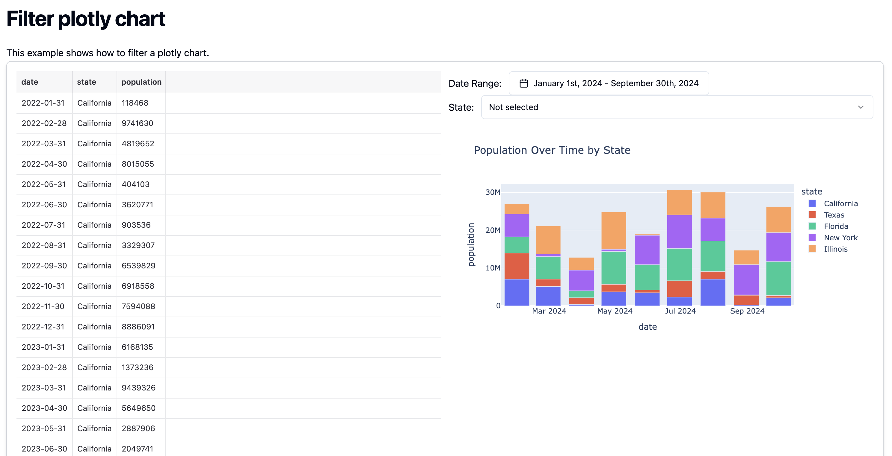
In this tutorial, you will create an application that filters and displays Plotly charts based on values received from input forms.
## Prerequisites
Please install pageckages in advance by the following command.
```bash pip theme={"dark"}
pip install plotly
```
```bash poetry theme={"dark"}
poetry add plotly
```
```bash uv theme={"dark"}
uv add plotly
```
## Output
 ## Tutorial
To create a dynamic application that switches the display content based on user input, you need to create an input form in the MDX file and pass its values to a Python function.
In the Python function, use `context.vars` to receive the values entered in the input form and filter the data for the chart to be returned.
In this tutorial, we also introduce how to obtain the options for the input form using SQL in addition to the above.
Here, we create the following two functions:
* `generate_population_data`: Generates the data used in the tutorial. In a production environment, this function can be used to fetch data. Additionally, this function can be replaced with an SQL file to fetch data from a database.
* `filter_plotly_chart`: Filters the data generated by `generate_population_data` and returns a Plotly chart.
Plotly and Matplotlib are automatically converted to HTML by Morph's library when returned as a Figure, making them usable with ``.
```python theme={"dark"}
import numpy as np
import pandas as pd
import plotly.express as px
import morph
from morph import MorphGlobalContext
@morph.func
def generate_population_data(context: MorphGlobalContext):
# Initialize
dates = pd.date_range(start="2022-01-01", end="2024-12-31", freq="M").strftime("%Y-%m-%d")
states = ["California", "Texas", "Florida", "New York", "Illinois"] # List of states
# Generate dummy data
data = pd.DataFrame({
"date": np.tile(dates, len(states)), # Repeat dates for all states
"state": np.repeat(states, len(dates)), # Repeat each state for all dates
"population": np.random.randint(100000, 10000000, size=len(dates) * len(states)) # Generate random population data
})
return data
@morph.func
@morph.load_data("generate_population_data")
def filter_plotly_chart(context: MorphGlobalContext):
data = context.data["generate_population_data"]
start_date = context.vars["start_date"]
end_date = context.vars["end_date"]
state = context.vars["state"]
# apply filter
df = data[data["date"].between(start_date, end_date)]
if state != "all":
df = df[df["state"] == state]
fig = px.bar(df, x="date", y="population", color="state", title="Population Over Time by State")
return fig
```
This SQL uses the data generated by `generate_population_data` to obtain the options used in `filter_plotly_chart`.
In other SQL, Python, and MDX `load_data`, you can access the results using the `get_state_list` specified by name.
```sql theme={"dark"}
{{
config(
name = "get_state_list"
)
}}
select
distinct state
from
{{load_data("generate_population_data")}}
```
Create a dashboard using Python functions and SQL.
The `defineState()` function allows you to declare states that can be used within the page.
* `dateStart`, `dateEnd`: The selected date range.
* `state`: The value of the selected state among the options.
Using `` and ``, the original data and chart are displayed.
By using `variables`, the values selected in the input forms are passed to the Python function.
```tsx theme={"dark"}
export const title = "Filter plotly chart";
import { defineState } from "@morph-data/components";
export const { dateStart, dateEnd, state } = defineState({
dateStart: "2024-01-01",
dateEnd: "2024-09-30",
state: "all",
});
# Filter plotly chart
This example shows how to filter a plotly chart.
```
## Tutorial
To create a dynamic application that switches the display content based on user input, you need to create an input form in the MDX file and pass its values to a Python function.
In the Python function, use `context.vars` to receive the values entered in the input form and filter the data for the chart to be returned.
In this tutorial, we also introduce how to obtain the options for the input form using SQL in addition to the above.
Here, we create the following two functions:
* `generate_population_data`: Generates the data used in the tutorial. In a production environment, this function can be used to fetch data. Additionally, this function can be replaced with an SQL file to fetch data from a database.
* `filter_plotly_chart`: Filters the data generated by `generate_population_data` and returns a Plotly chart.
Plotly and Matplotlib are automatically converted to HTML by Morph's library when returned as a Figure, making them usable with ``.
```python theme={"dark"}
import numpy as np
import pandas as pd
import plotly.express as px
import morph
from morph import MorphGlobalContext
@morph.func
def generate_population_data(context: MorphGlobalContext):
# Initialize
dates = pd.date_range(start="2022-01-01", end="2024-12-31", freq="M").strftime("%Y-%m-%d")
states = ["California", "Texas", "Florida", "New York", "Illinois"] # List of states
# Generate dummy data
data = pd.DataFrame({
"date": np.tile(dates, len(states)), # Repeat dates for all states
"state": np.repeat(states, len(dates)), # Repeat each state for all dates
"population": np.random.randint(100000, 10000000, size=len(dates) * len(states)) # Generate random population data
})
return data
@morph.func
@morph.load_data("generate_population_data")
def filter_plotly_chart(context: MorphGlobalContext):
data = context.data["generate_population_data"]
start_date = context.vars["start_date"]
end_date = context.vars["end_date"]
state = context.vars["state"]
# apply filter
df = data[data["date"].between(start_date, end_date)]
if state != "all":
df = df[df["state"] == state]
fig = px.bar(df, x="date", y="population", color="state", title="Population Over Time by State")
return fig
```
This SQL uses the data generated by `generate_population_data` to obtain the options used in `filter_plotly_chart`.
In other SQL, Python, and MDX `load_data`, you can access the results using the `get_state_list` specified by name.
```sql theme={"dark"}
{{
config(
name = "get_state_list"
)
}}
select
distinct state
from
{{load_data("generate_population_data")}}
```
Create a dashboard using Python functions and SQL.
The `defineState()` function allows you to declare states that can be used within the page.
* `dateStart`, `dateEnd`: The selected date range.
* `state`: The value of the selected state among the options.
Using `` and ``, the original data and chart are displayed.
By using `variables`, the values selected in the input forms are passed to the Python function.
```tsx theme={"dark"}
export const title = "Filter plotly chart";
import { defineState } from "@morph-data/components";
export const { dateStart, dateEnd, state } = defineState({
dateStart: "2024-01-01",
dateEnd: "2024-09-30",
state: "all",
});
# Filter plotly chart
This example shows how to filter a plotly chart.
```